Why the transparent menu bar in Leopard was a bad idea.
I got Molly the Leopard update Friday night. It wasn't the most stress-free update, but it worked on the 2nd attempt. That a four month old MacBook would require two attempts to update reflects rather poorly on software that was gestating two years. It should have been painless. But that's another post.
The thing that some folks seem to dislike is the transparent menu bar. In my brief run with it, it doesn't bother me that much, but it does present one of those 'what where they thinking' moments that you get used to with Apple. (Closing the iPhone to developers was the previous WWTT moment, and like that one, I think the menus will get fixed).
Molly, inadvertently, gave me a nice test case, to make the point, that transparent menu bars can lead to goofyness. I say inadvertent, because Molly was just being Molly. She finds cute desktop graphics in the tubesphere.
Here's her desktop:
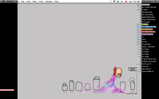
Notice the black borders? When she was running Tiger, the menu bar was the end of the picture. Now, under Leopard, she gets this goofy look:

It just looks sloppy.
The thing that some folks seem to dislike is the transparent menu bar. In my brief run with it, it doesn't bother me that much, but it does present one of those 'what where they thinking' moments that you get used to with Apple. (Closing the iPhone to developers was the previous WWTT moment, and like that one, I think the menus will get fixed).
Molly, inadvertently, gave me a nice test case, to make the point, that transparent menu bars can lead to goofyness. I say inadvertent, because Molly was just being Molly. She finds cute desktop graphics in the tubesphere.
Here's her desktop:
Notice the black borders? When she was running Tiger, the menu bar was the end of the picture. Now, under Leopard, she gets this goofy look:
It just looks sloppy.
posted by Lee at 10:38 AM
![]()
![]()


0 Comments:
Post a Comment
Links to this post:
Create a Link
<< Home